Type: Client work — completed while serving as Senior Visual Designer at P3 Agency
Role: Visual identity, website design, responsive design system, UX/UI
Disciplines: Brand identity application · Website design · Responsive design systems · Visual hierarchy & UX


KAM Roofing Services is a home-services contractor in the Tampa Bay area with a real reputation, years of craftsmanship, client trust, and quality work, but a website that did none of that justice. The existing site was visually inconsistent, unworkable on mobile, and structured around a generic contractor template that made KAM look like every other roofing company on the first page of Google.
The challenge behind the challenge: home-services clients choose contractors on trust, and trust is built before the first phone call. A roofing company's website isn't just a source of information; it's a credibility signal. Every visual decision, from the color of a button to the hierarchy of a service page, either reinforces the message "this company does excellent work" or quietly undermines it.
The brief was to rebuild that first impression from the ground up.
The original site had the common contractor-website symptoms: stock photography that could belong to any company, typefaces used inconsistently across pages, a color palette that had drifted from the logo, and a navigation structure that buried the services a visitor actually wanted to find.
Underneath the cosmetic issues was a more fundamental problem: the site had no point of view. KAM Roofing had a clear professional identity, quality craftsmanship, local expertise, and customer commitment, but none of that came through in the visual language. The site read as generic rather than trustworthy, which in a high-consideration category like home services is a significant conversion barrier before any CTA strategy comes into play.
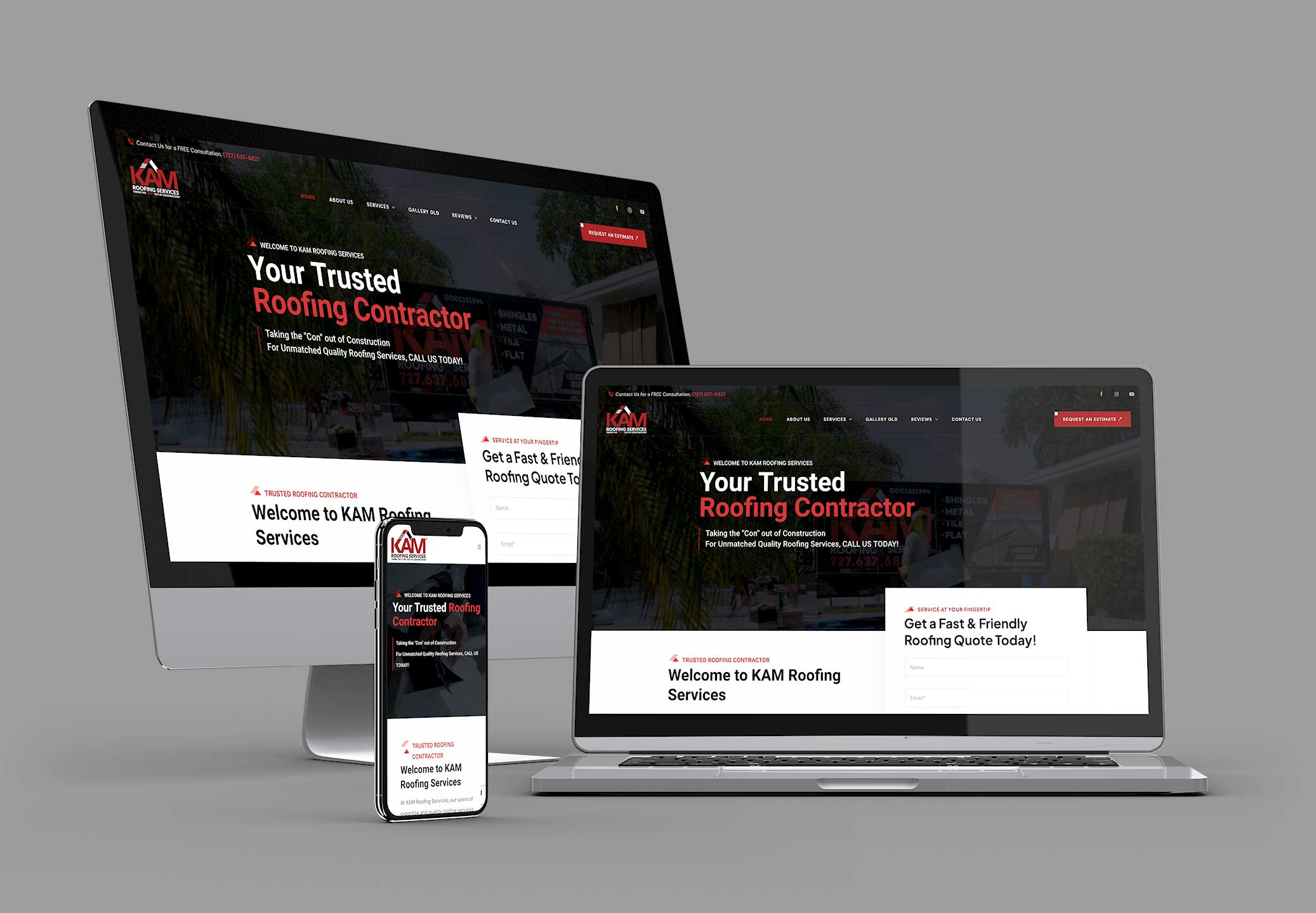
The redesign began with establishing a consistent visual language that could carry across every page and surface of the site. Rather than designing page-by-page, the system was built first: a defined color palette applied consistently (primary brand color as the dominant action color across CTAs, section dividers, and key callouts), a deliberate typographic hierarchy (display weight for section headlines, medium for service names, regular for body copy and form labels), and a photography direction real craft, real projects, real results to replace the generic stock imagery.
That set of rules, color, type, imagery, and spacing, became the grid on which the entire site was built. Each page was a consistent application of those rules, not a separate design decision.
The navigation was restructured around the way customers actually move through a roofing decision: understand the company → see the services → verify the quality (gallery, testimonials) → take an action (call, quote request). The previous site's architecture buried the services behind generic "About" content, and put the contact form at the end of a path most users never completed.
The restructured site brought services to the top level of navigation and gave each core offering, roof replacement, repair, and commercial roofing, its own page with consistent structure: a clear headline, a short benefit-led summary, process explanation, and a localized CTA. That consistent page template meant every service page reinforced the same brand message rather than varying in quality and tone.
Mobile design was built in from the outset rather than retrofitted. At the time, a significant portion of home-services search happens on mobile, someone on a ladder, a homeowner finding a leak, and the mobile experience needed to be as functional as the desktop version, not a shrunken version of it.
The contact and quote-request forms were redesigned not just for conversion, but for brand consistency. Form design is often treated as a functional afterthought in web projects; here, the form components (field labels, input styling, button treatment, confirmation state) were designed to match the brand's visual language, so the moment of highest intent, when a potential customer decides to reach out, feels as trustworthy and professional as the rest of the site.
The call-to-action strategy was simplified: one clear primary CTA per page (free estimate / request a quote), with a secondary phone number visible in the header across all pages. The reduction in competing action choices was a design decision, not just a conversion tactic. Clarity is part of how the brand communicates confidence.
KAM Roofing is a clear demonstration of what visual systems thinking does for a brand that already has quality behind it, but isn't communicating it well. The craft existed; the work was to design a digital presence that made it visible. By establishing a consistent visual language first and then building every page from that system, the redesign gave KAM Roofing a site that reads as one brand, trustworthy, competent, and local rather than a collection of loosely related pages.
The project also reinforced something I think about in every brand context: in a high-consideration category where trust is the product, design credibility and service credibility are inseparable. Getting the visual system right wasn't an aesthetic preference; it was the brief.
