Type: Client Project | STRAY Creative Co. — sole designer, discovery through launch
Role: Brand strategy, logo system, brand guidelines, website design & build, launch collateral, behavioral analytics
Disciplines: Brand identity systems · Logo design · Brand strategy & messaging · Website design & development · Marketing collateral · Behavioral analytics





Whitney Pokorny spent five years selling for Boston Scientific — surpassing goals, earning recognition, learning the operating room from the inside. Then she moved into recruiting, because she'd noticed something: most of the people hiring medical sales reps had never been medical sales reps.
She came to me with a thesis and a network. She did not have a company.
That was the brief. Prestige Recruiting Group didn't exist yet — no mark, no site, no way for a hiring manager who'd never heard of her to decide she was worth a phone call. And in recruiting, that decision is the product. A hiring manager isn't buying a service; they're deciding whether to trust a stranger with a role they're personally accountable for. A firm that looks new doesn't get that trust. A firm that looks established does.
So the work carried a constraint most identity projects don't: on day one, with no track record to point at, the brand had to read as though it had been doing this for years. Not by overclaiming — by being built with the care that established firms telegraph and new ones usually skip.
Before drawing anything, I built the brand's strategic foundation with Whitney: mission, goals, core values, key messages, unique selling propositions, and a documented map of her clients' pain points.
Most of that document is the kind of thing that gets written once and filed. One part of it determined everything that followed.
Prestige has two audiences, and they want opposite things.
Hiring managers — the primary audience — want risk removed. They've been burned by bad fits, by turnover, by resumes that waste an afternoon.
Candidates want access: insider knowledge, and roles that match where they're trying to go.
Most recruiting firms write one message and hope it lands on both. We wrote two tracks and kept them separate. That decision is why the mark works, and it's why the site's most important page is built the way it is.
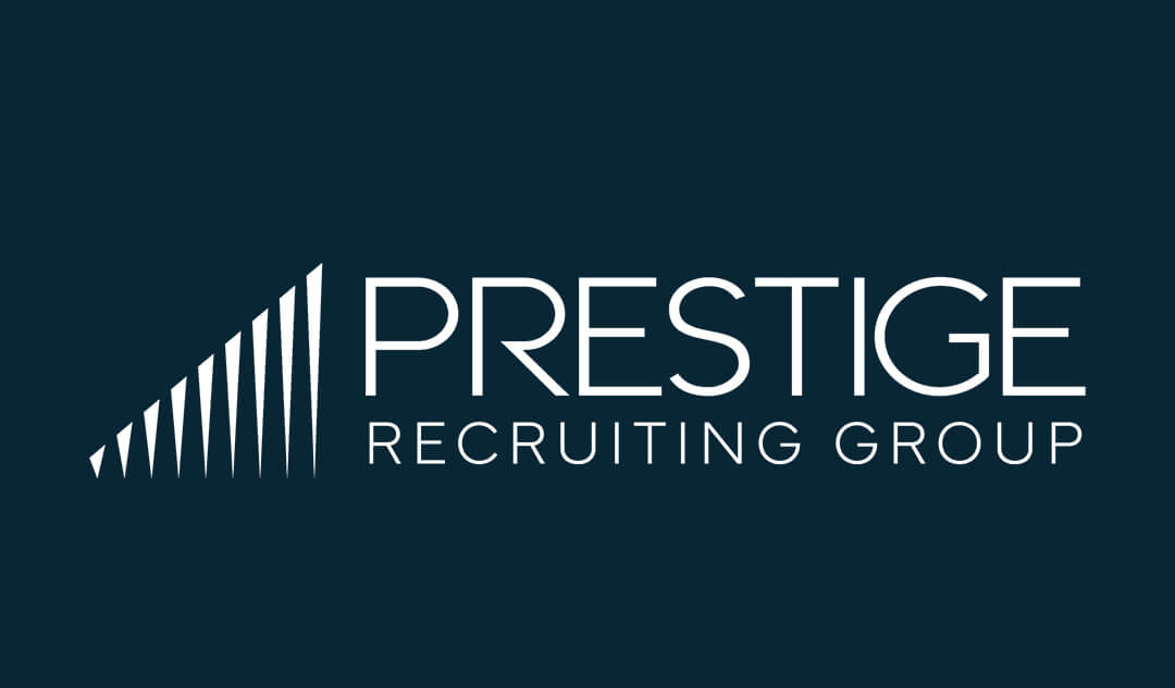
The mark is a row of tapered vertical strokes ascending left to right.
Read one way it's a bar chart — growth, placements, results. That's the language a hiring manager already thinks in. Read the other way it's a career trajectory, which is what a candidate is actually shopping for. One symbol, both audiences, no compromise.
The taper is doing work. Straight rectangles would have read as a static chart — a report, a past tense. The strokes narrow toward the top, and that gives the set momentum. It reads as ascending rather than as ascended.
Scale was designed in from the start, not discovered afterward:
- The full lockup — mark left, PRESTIGE in light geometric caps, RECRUITING GROUP letterspaced beneath. Website header, sell sheet, signatures.
- The mark alone — app icon and favicon, white on near-black in a rounded square. It survives 32px because the construction is simple and the stroke count is low. That count was a design decision, not an aesthetic one.
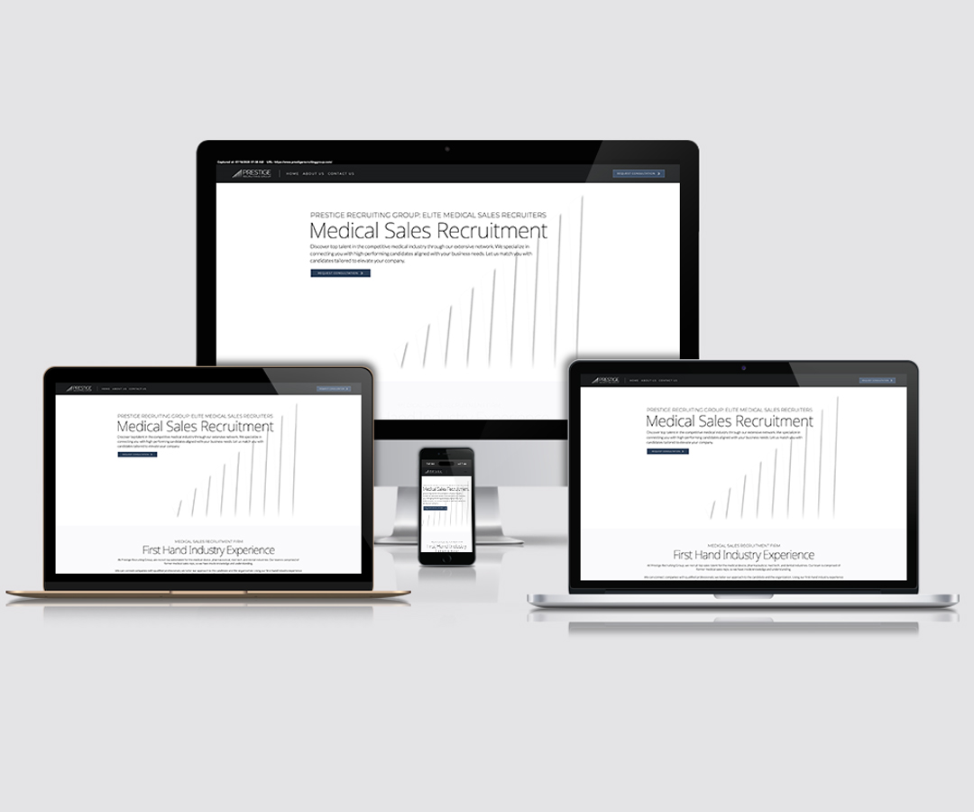
- The mark as illustration — on the homepage, the same asset scales up to fill the hero, ghosted behind the headline. It's the page's only graphic, and it cost nothing to make because it already existed.
That last one is the principle I keep returning to in identity work: a mark shouldn't just sit in the corner of things. It should be a system asset the rest of the brand can be built out of.
Medical recruiting has a visual default — blue gradients, stock handshakes, someone smiling in scrubs. It's a category that looks like itself, which means nothing in it looks like anything.
The system's entire argument is restraint.
- Color — near-black navy as the dominant field, white and a pale grey ground, and a single muted slate-blue reserved for action: buttons, links, emphasis. One accent, used sparingly, outperforms a palette.
- Type — a light geometric sans across the whole system, with weight and letterspacing doing the hierarchy work instead of a second typeface. Headlines set in sentence case rather than caps. The result reads quiet and considered, which is the brand's actual message.
- A secondary motif — flowing parallel line work over a halftone dot field, giving collateral surfaces texture without requiring photography a startup doesn't have yet.
Restraint here is a strategy, not a taste. In a category that oversells, the brand that under-sells reads as the one that doesn't have to.
Three pages: Home, About, Contact. The architecture follows the two-audience split.
Home answers the hiring manager's question — who are you, and why should I trust you. The consultative process is laid out step by step, because a hiring manager evaluating a recruiter is really evaluating a process. Above it sits the thesis in four words: First Hand Industry Experience.
About is where recruiting firms usually go generic. This one leads with the differentiator and then proves it with three full bios — Whitney's Boston Scientific tenure, Katie's Insulet and Johnson & Johnson track record, Lacy's Align Technology work. The bios are the product. If the pitch is "every recruiter here has done the job," the evidence has to be on the page, at length, with names attached.
Contact is where the strategy pays off. The form has two tabs: For Organizations and For Applicants. Two audiences, two paths, chosen by the visitor in one click.
Most recruiting sites run a single generic contact form, which pushes both audiences through the same door and delivers the firm the same undifferentiated inquiry. The applicant path adds a resume drag-and-drop and industry checkboxes — medical device, pharmaceutical, med tech, dental — so the inquiry arrives pre-sorted.
That form isn't a UX flourish. It's the messaging document, rendered.
A recruiting firm's brand doesn't live on its website. It lives in an inbox and a LinkedIn feed. A hiring manager sees the email signature before they ever see the homepage.
So the launch kit covered the surfaces that actually carry the first impression:
- Email signatures — a per-recruiter template carrying the line motif, name, title, and contact. Every email the team sends is a branded surface.
- LinkedIn banners — company profile (1128×191) and personal profile (1584×396). Same message, two crops, each built around where LinkedIn drops the avatar and what it cuts off.
- Job post template — a reusable layout for openings: role, markets, comp band, benefits, where to send resumes. Whitney fills it in and posts it.
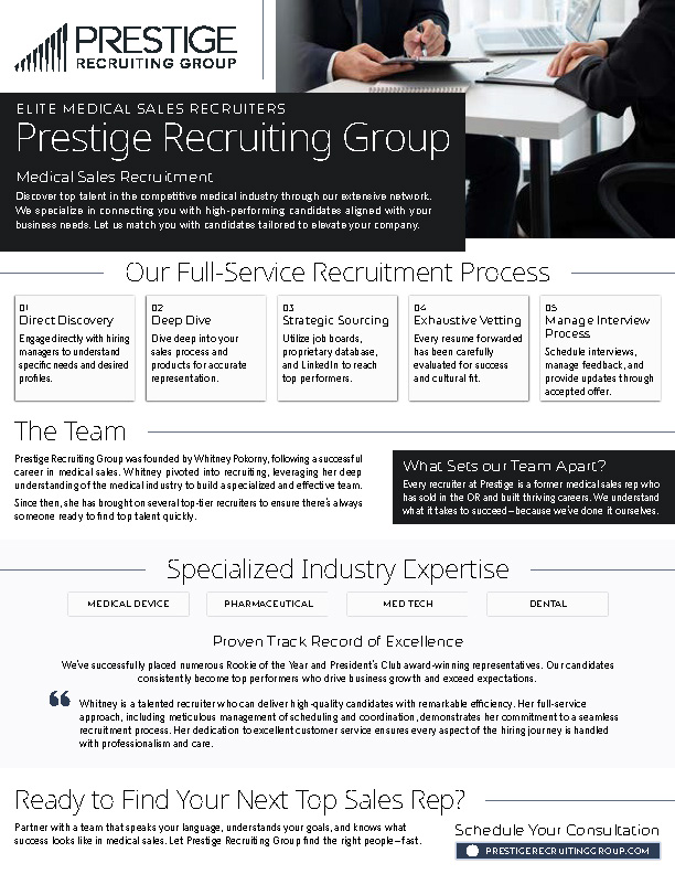
- Sell sheet — a single-page leave-behind covering the process, the team, the specialties, and the proof.
The test of an identity system isn't the logo presentation. It's whether the client can use it without me. The job post template is the one I'd point at: Whitney has published roles from it repeatedly without opening a design tool or asking me for a file.
I instrumented the site with Microsoft Clarity — heatmaps, scroll depth, behavioral signals — because a launch is a hypothesis, not a conclusion. Handing a client a site and never looking at what people do on it is how a brand quietly stops working.
The audience is at a desk. 77% of sessions come from a PC, 21% from mobile. That's the inverse of the home-services work I'd been doing, where a homeowner finds a leak and searches from a phone. A hiring manager evaluating a recruiting firm does it during the workday, at a desk, with six other tabs open. Same designer, opposite responsive priority, because the audiences aren't the same. Design decisions don't travel between categories — only the discipline of checking does.
The site confuses more than it frustrates. Rage clicks — the signal for genuine anger — sit at 0.64%. Dead clicks, where someone clicks an element that isn't interactive, run 12.82%: roughly one session in eight. The heatmaps located them precisely.
People were clicking the client testimonial. It turned out the quote was rendering truncated — opening mid-sentence — and visitors were clicking to read the rest. Nothing happened. A content bug was producing a behavior signal, and the behavior signal is how I found the content bug.
The other cluster was subtler: a set of process cards. They're built as cards, and cards read as interactive. Nothing about them said "this is only a paragraph." That's a legibility failure in my own system — I gave static content an affordance it hadn't earned.
People navigate; they don't scroll. Only about a quarter of desktop visitors and a third of mobile visitors get past the halfway mark. But the first thing a desktop visitor clicks is Contact Us or About Us, and mobile visitors open the menu and go straight to Request Consultation.
Those two facts aren't in tension. They're the same finding. This audience doesn't read a homepage — they navigate one. The architecture is doing its job; the homepage is longer than the audience's patience for it, and everything below the midpoint is being paid for and not seen. That's a conclusion I couldn't have reached from a mockup, and it isn't flattering — I built that homepage.
The build holds up. 94 out of 100 on performance, every Core Web Vital green. The contact page — the page the whole architecture points at — scores 95 with a 0.24-second Largest Contentful Paint. On a site made of heavy dark fields and full-bleed graphics, that isn't luck; it's the asset and compression decisions from the build showing up later as a number.
Prestige is the project where brand strategy and interface design turned out to be the same decision.
The two-audience split didn't come from a design insight. It came out of a messaging document, written before any visual work started. But it's what determined the site's architecture, the contact form's structure, and the mark itself — a symbol that has to mean "growth" to a hiring manager and "trajectory" to a candidate simultaneously.
That's the case for doing strategy first, and it's why I don't treat it as a separate phase that happens before the real work. The strategy isn't a document that precedes the design. It's the thing the design is made of.
What I carried forward: when a client has no track record, the brand is the track record. Every choice — the restraint, the sentence-case headlines, the single accent, the bios that run long — was doing one job, which was making a new firm legible as one worth a hiring manager's phone call.

Launching my own business was a huge step, and finding the right person to build my website from the ground up was critical. Stacey was exactly who I needed. She listened closely to my ideas and brought them to life with creativity and professionalism.
The site she created not only reflects my brand perfectly but has also played a major role in the growth of my business. I've seen significant results since the launch, and I truly believe Stacey’s work was a key factor in that success. I'm so grateful for her expertise and would highly recommend her to anyone looking to build or revamp their online presence.