Type: Concept project
Role: Brand identity, packaging design, vehicle wrap, out-of-home, merchandise
Disciplines: Brand identity systems · Packaging · Vehicle wrap (mobile branded environment) · Out-of-home · Pattern & merchandise


Urban Organic is a concept project I created during my graphic design studies: a brand for a fictional mobile juicery, built to live on a bottle, on a truck, and everywhere in between. The brief was to fuse two opposite sensibilities: the warmth and vibrancy of Thai visual culture and the geometric order of De Stijl (the movement that shaped Bauhaus design thinking). The result had to feel fresh and organic in the hand, and structured and unmistakable from across a street.
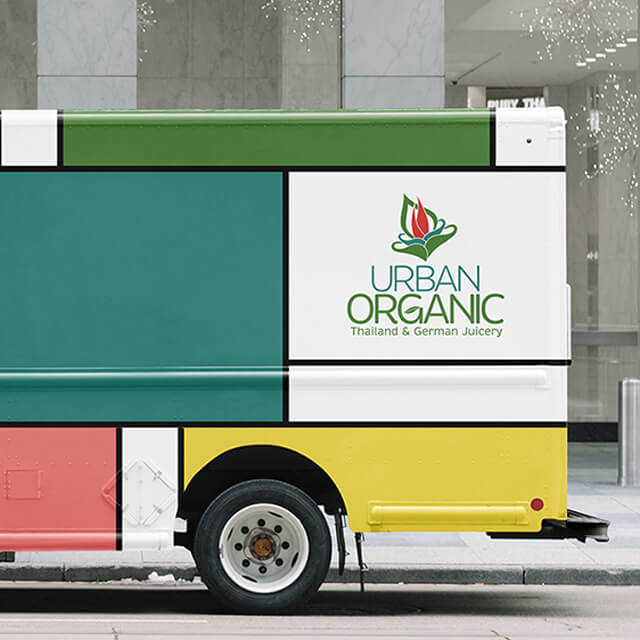
The real test of the system was range: the same brand had to work as a small package (nutrition panel, certifications, barcode, ingredient deck) and as a full vehicle wrap, a moving branded environment that has to read at a glance and at speed.
The mark is a single growing form a flame-like bloom cradled in a pair of leaf-shaped hands standing for nourishment, care, and freshness. Around that organic symbol, I built a deliberately rigid framework: a De Stijl–inspired grid of color blocks (red, teal-green, and yellow) divided by clean black rules. The tension between the soft, hand-drawn mark and the strict geometric grid is the brand Thai vibrancy held inside German structure.
Because this brand had to work on everything from a bottle cap to a truck panel, the work started with a consistent kit of parts.
- The mark runs in full color on light surfaces and as a single-color (white) version for dark grounds and engraved merchandise, so it holds up across materials and scales.
- Color is a structured palette a warm red, a teal-green, and a sunlit yellow, organized by black rules and balanced with white and a cream ground applied as flat color blocks rather than decoration.
- Type pairs a clean geometric sans for the wordmark and headlines with a legible sans for ingredient decks, nutrition panels, and menu copy.
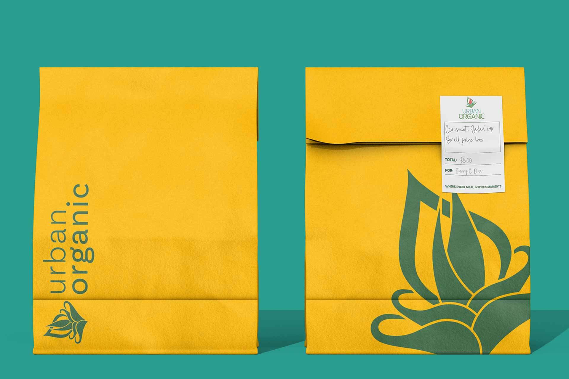
- A secondary pattern of stylized fruit (grapefruit, kiwi) extends the brand onto wraps, cups, and liners a brand asset beyond the logo.
This is the depth of the project a brand taken all the way onto packaging.
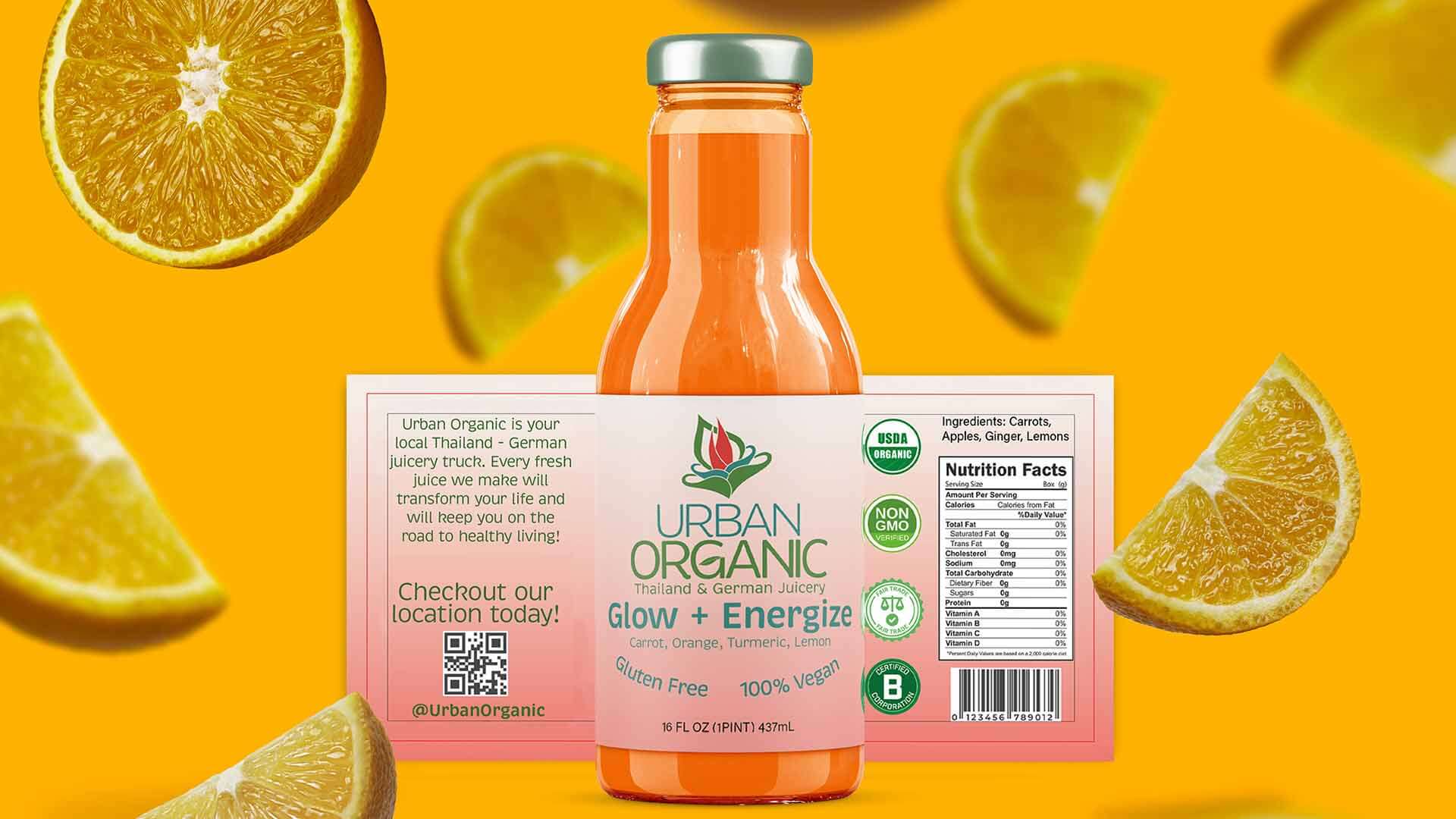
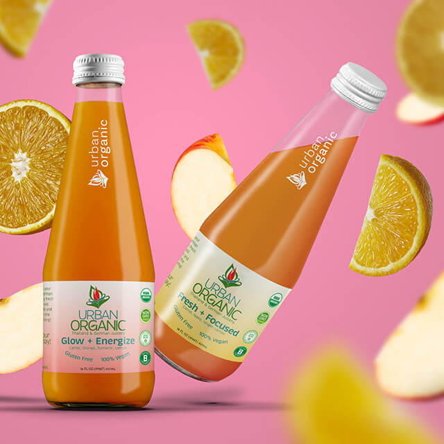
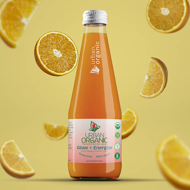
- Juice bottle — a full three-panel system: a front face with the mark, flavor name ("Fresh + Focused"), and certifications; a side with the brand story and a location QR code; and a back with the ingredient deck, nutrition facts, and barcode. The wraparound label is built as full artwork across all three panels.
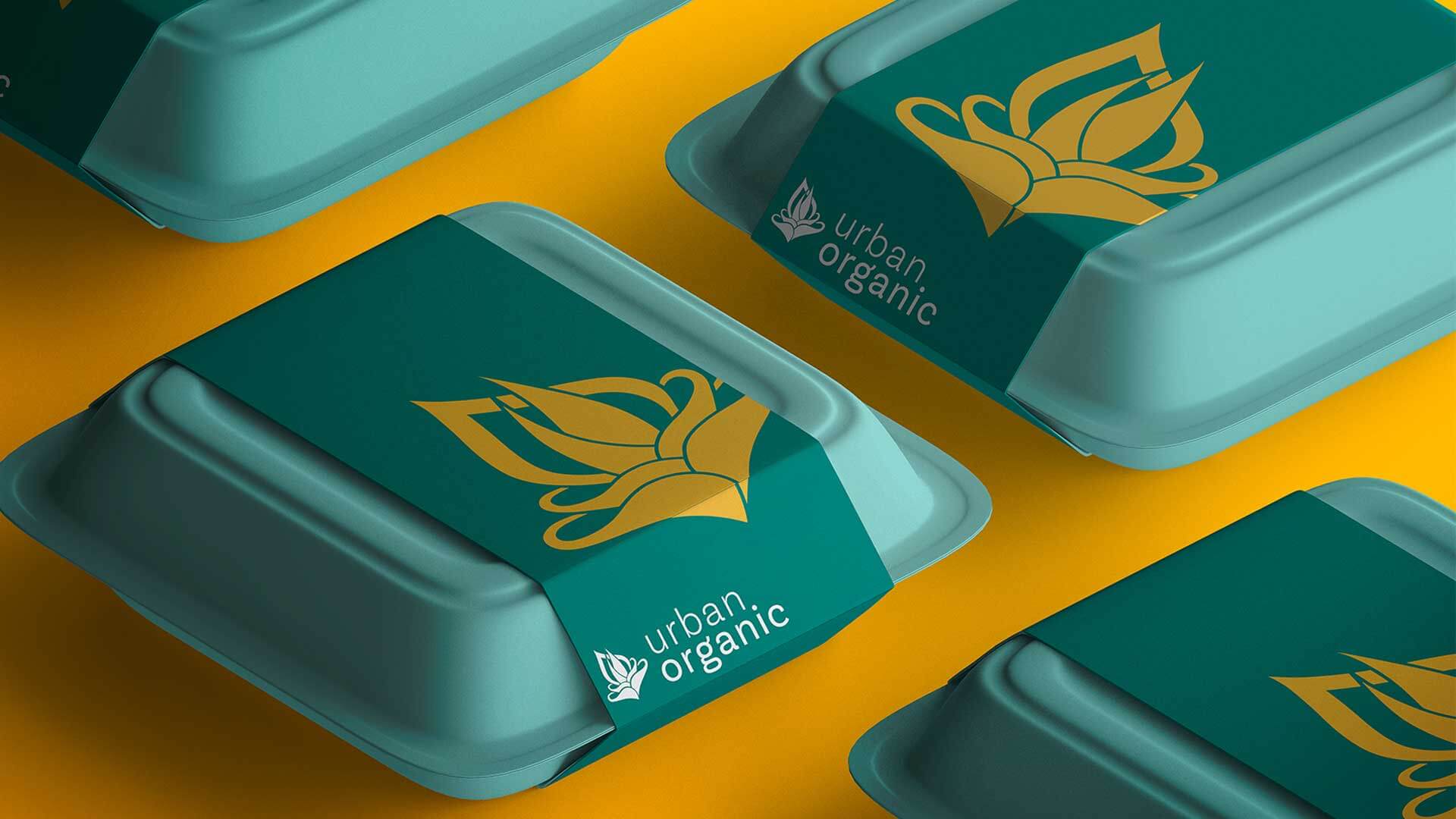
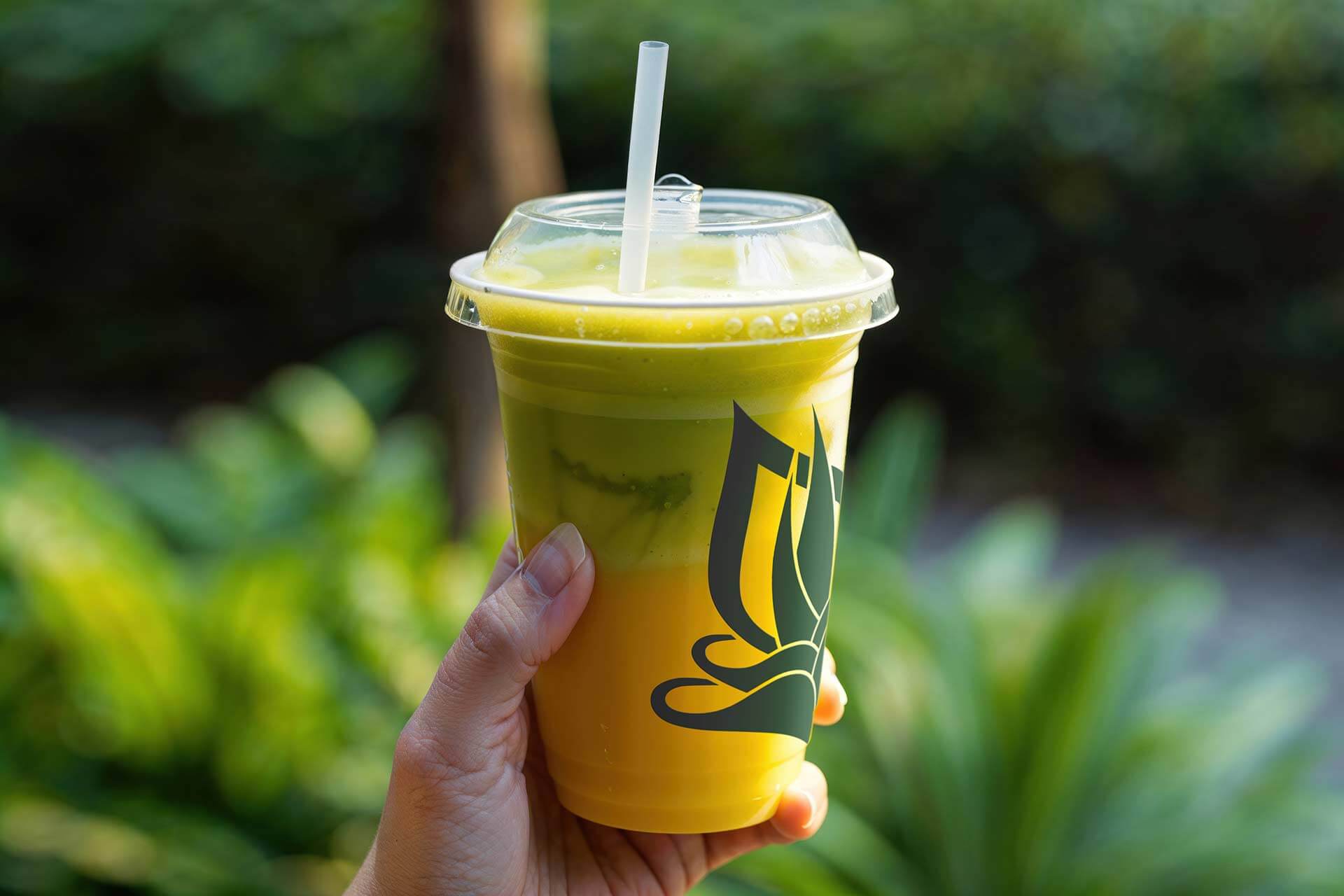
- Takeout bowl & cup — the color-block system wrapping cylindrical and tapered forms, with the pattern lining the carry bag.
- Carry bag & liner — the fruit pattern turning the secondary packaging into part of the brand experience.
Designing these meant thinking about how a package actually works, panel hierarchy, where the nutrition facts, certifications, and barcode sit, and how copy wraps a curved surface while keeping the system visually intact.
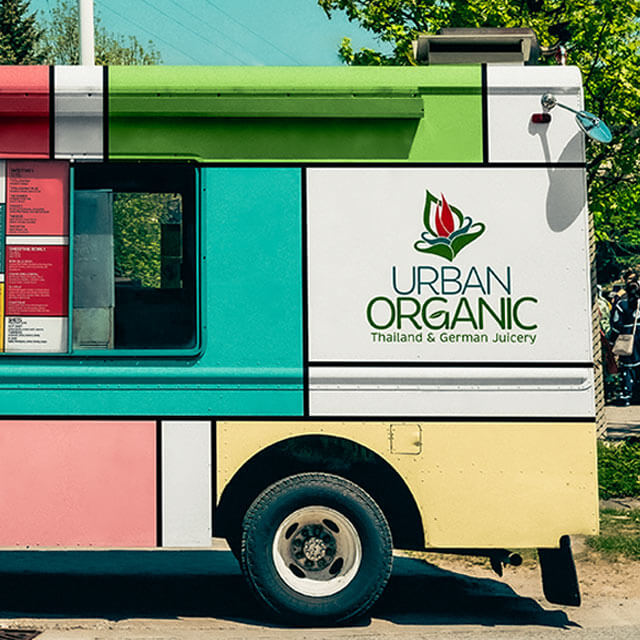
The juicery is mobile, so the truck is the brand's largest and most public surface, a branded environment that travels.
- Both sides wrapped in the De Stijl color-block system, sized and arranged so the mark and color story read instantly from a distance and at speed
- Service side integrates the full menu directly into the wrap, so the vehicle becomes the storefront, the signage, and the menu board at once.
Designing a wrap meant thinking the way environmental graphics do: in terms of viewing distance, sightlines, how a curved and paneled surface breaks up artwork, and how a person reads a brand while they are moving.
- Transit poster — the color-block system adapted to a vertical out-of-home format for a station environment, carrying the truck illustration, value message, and a QR to find the day's location.
The menu organizes a large offering juice cups, bottles, smoothies, smoothie bowls, and shots into a single color-coded board, using the brand's blocks and rules to make a dense list scannable and on-brand. The same artwork lives on the truck's service side, so the menu and the vehicle are one system.
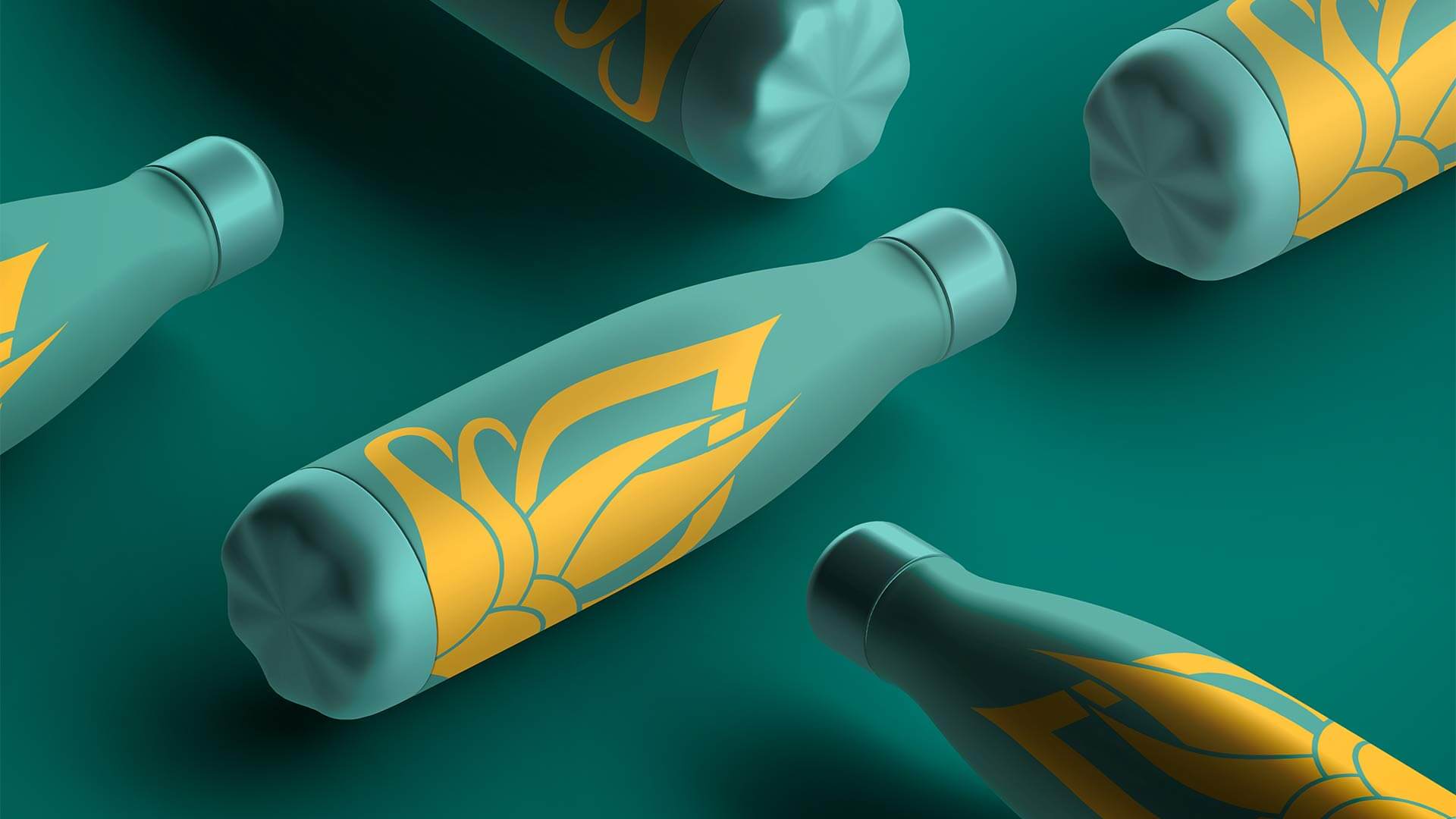
- Reusable bottles — a black anodized bottle with an engraved single-color mark and a white printed bottle with the full-color mark, showing the identity across finishes.
- Tee & tote — the mark applied to apparel and a carry tote, extending the brand past the point of sale.
Urban Organic is the project where I worked on a single system across a wide range of surfaces at once: a bottle label, a full vehicle wrap, out-of-home, a menu, and merchandise, all drawn from one geometric framework and one organic mark.
As a concept project, it's also where I practiced designing for the surfaces brands actually live on: the requirements of a nutrition panel and a barcode on one end, and the considerations of a moving, wrapped vehicle distance, sightlines, and paneling on the other.
