Type: Client Project | Completed while serving as Senior Visual Designer at P3 Agency
Role: Brand identity, logo system, business cards, print collateral (flyers, postcards), website design, website content writing
Disciplines: Brand identity systems · Logo design · Print & promotional collateral · Multi-page website design




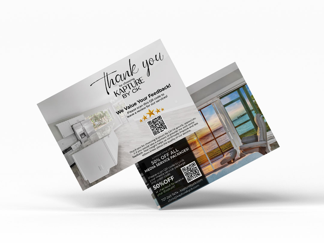
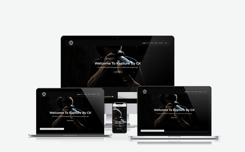
Kapture By CK, based in Tampa Bay, is a photography business centered on capturing and preserving moments. Founded in 2020 by Chris Kaiser, a former corporate leader with a 40-year passion for photography, the studio operates in four areas: destination, pet, real estate and drone photography, and corporate work. Each serves a unique audience but must present as a unified brand.
The challenge: build a mark that conveyed craft, professionalism, and personality without feeling generic in a crowded local photography market, then carry that identity across every surface a client might encounter, from a first impression on a flyer to a full website experience.
The aperture embodies photography: it controls light, opens to the world, and frames what is kept. The Kapture By CK mark visually symbolizes this, with a stylized camera aperture of six overlapping blades forming a circle, surrounding a concentric lens or ripple. The bold “KAPTURE” runs across the horizontal in a wide, spaced sans-serif font, with “BY CK” underneath in a lighter weight.
The mark looks confident and industry-specific from afar, revealing lens details and blade shapes up close. Its all-caps wordmark through the aperture ring gives it an assertive, signature feel—more than just a decorative logo, it’s a stamp.
The system comes in two colors: white-on-black for digital impact and primary presence, and black-on-white for print where dark backgrounds are less practical. Both keep the mark intact; no simplified version was necessary for its scale.
Because Kapture By CK serves four distinct service categories: real estate agents, pet owners, corporate clients, travelers, and photography students, it needed a unified visual language rather than four separate micro-brands.
The kit of parts includes:
- An aperture mark as a graphic device, not just a logo. Shutter blade shapes are used as image-masking frames in print collateral, with service-specific flyers featuring photos cropped into blade-shaped windows, creating a layout motif that ties back to the brand's core visual idea.
- A strict color palette: a near-black background, white type and mark, with a warm gold/olive accent for hierarchy and callouts on digital surfaces. This restraint allows the photography to take center stage.
- Typography pairing a wide-tracked sans for the wordmark and headlines with a clean sans for body copy and labels, ensuring legibility across all formats.
- The aperture icon alone functions as a standalone identifier at small scales, such as favicons and navigation marks, reducing the need for full lockups.
- Business Cards — Two versions display the same hierarchy: Chris Kaiser’s name and title, a lighter service descriptor, contact details with icons, and a QR code. The white version features a near-black wordmark; the dark version inverts the palette. Both include a subtle aperture symbol behind the contact info.
- Service Flyers — Two flyers for pet photography and real estate, using aperture blade shapes. Photographs are clipped into outward-opening panels like a shutter. The left side has the headline, subhead, body, and CTA, while images fill the right two-thirds. Both flyers share branding but are tailored to their audiences.
- Postcards — Two formats serve different client moments:
The site aims to convert visitors into clients and build Chris Kaiser's credibility across photography disciplines.
Architecture. It features Home, About, Packages (with sub-pages for services), Reviews, and Contact. Each page ends with a CTA: “Looking For High-Quality Photography in Tampa Bay? Contact Kapture By CK!”
Visual system. The site uses a near-black-and-white scheme with warm gold/olive accents, emphasizing headings with bold or gold for quick readability.
About page. Shares the founder’s story, including a life pivot, 40 years of passion, and combined professional and photography experience. It features a portrait and two text blocks, humanizing the brand. The footer repeats a brand statement about light, color, and passion, reinforcing the emotional connection.
Kapture By CK is a brand identity built on a single design decision that paid off across every surface: treating the logo's geometric logic as a system asset rather than just a symbol. By extracting the aperture blade form and using it as an image-masking device in print, the mark became a recurring motif that connects a business card, a flyer, and a website without ever feeling repetitive.
The broader challenge here was coherence across four distinct service verticals, each with its own audience and tone. The system holds because the visual rules, near-monochrome field, single accent, consistent mark hierarchy, and blade geometry as a layout device are strict enough to unify the verticals without requiring each one to look identical. A pet photography flyer and a real estate postcard look like they come from the same studio, even though their subject matter and clients are entirely different.
That's the work I was most interested in at P3 Agency: not just producing individual pieces, but thinking about the rules that make every piece legible as part of one brand and then trusting those rules to carry the system as it scales.